
DNY59/E+ via Getty Images
Investment Thesis
Most of us have accepted the inevitable: interest rates are rising. Probabilities for May 2023 suggest the Fed Funds rate in the 3-3.5% range or more than 2% above current levels, and it’s only prudent to consider strategies that specifically defend against rising rates. That’s why the ProShares Equities for Rising Rates ETF (NASDAQ:EQRR) is so compelling and why it’s an easy complement for Index investors. This article will take you through the strategy, historical performance, and fundamentals of EQRR’s current holdings. I will also perform a detailed performance attribution analysis to identify the source of excess returns since rates bottomed in March 2020. In my view, EQRR is a nice addition, but you can do just as well by making a few simple changes to your portfolio’s sector exposures, and therefore, I’m limiting my rating to a hold.
EQRR Overview
Strategy and Fund Basics
As the name suggests, EQRR is built for a rising rate environment. Tracking the rules-based Nasdaq U.S. Large-Cap Equities For Rising Rates Index, EQRR targets the top five sectors with the highest correlation to 10-Year U.S. Treasury Yields over the last three years and repeats this process quarterly. Stocks within these sectors are selected based on those that have demonstrated a tendency to outperform when rates rise. In total, 50 stocks are chosen, so it’s pretty focused and why ProShares recommends it as a complement to your portfolio rather than a substitute.
Here are some of the data points used in developing the Index to demonstrate the strategy in action. On December 31, 2021, the Index was significantly overweight Financials and Energy based on their three-year average correlation with 10-year Treasury rates.
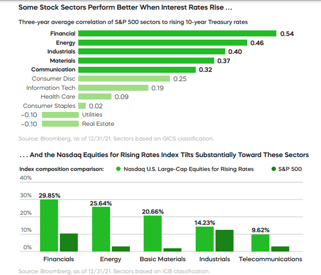
ProShares: An Equity Strategy Built For Rising Rates
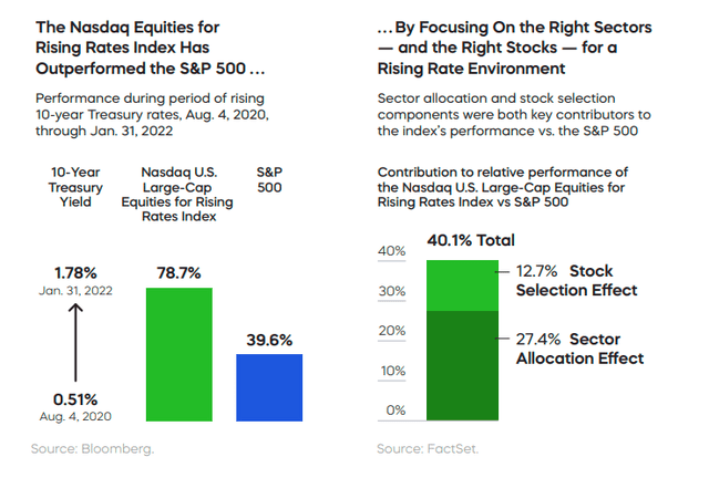
Financials benefit from the steeper yield curves that commonly accompany higher rates, while Energy is often the primary driver of the inflation that leads to those higher rates. These facts are well-known to many, but what caught my attention was the performance attribution analysis done as of January 31, 2022. While EQRR undoubtedly benefited from investing in the right sectors since the summer of 2020, ProShares also claims it held the right stocks in the right sectors over this period, too. I know how hard it is for a portfolio to earn such a significant stock selection effect (12.7%) from performing dozens of performance attribution analyses myself. I’ll be putting this to the test later.
ProShares: An Equity Strategy Built For Rising Rates
Before we get to the fund’s current exposure areas, here is some additional information on EQRR you might find helpful.
- Current Price: $50.18
- Assets Under Management: $47 million
- Expense Ratio: 0.35%
- Launch Date: July 24, 2017
- Trailing Dividend Yield: 1.67%
- Three-Year Dividend CAGR: -3.39%
- Dividend Frequency: Quarterly
- Five-Year Beta: 1.54
- Number of Securities: 50
- Portfolio Turnover: 105% (49%, 89%, 147% From 2018-2020)
- Assets in Top Ten: 29.42%
- 30-Day Median Bid-Ask Spread: 0.19%
- Tracked Index: Nasdaq U.S. Large-Cap Equities For Rising Rates Index
- Short-Term Capital Gains Tax Rate: 40%
- Long-Term Capital Gains Tax Rate: 20%
- Tax Form: 1099
While the 0.35% is probably reasonable for a specialty ETF, the 0.19% bid-ask spread is quite large and should be added to the cost of trading. I suspect many of EQRR’s holdings are riskier than their sector peers, which might contribute to the significant stock selection effect mentioned earlier. The high turnover suggests it would be difficult for an individual investor to replicate this strategy to save on fees. Still, I’ll explore the possibility of just modifying one’s sector exposures to create the same effect.
Sector Exposures and Top Ten Holdings
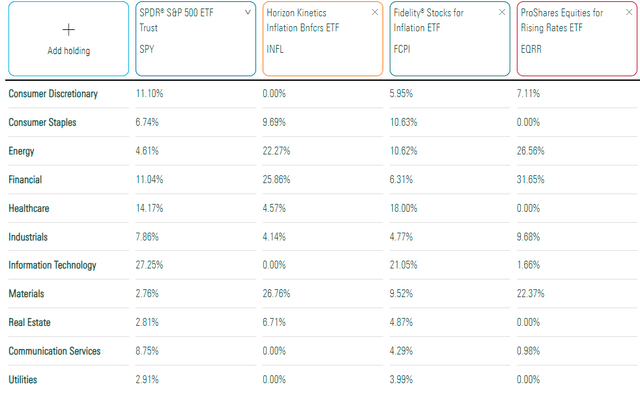
The table below highlights EQRR’s sector exposures compared to three ETFs: the SPDR S&P 500 ETF (SPY), the Horizon Kinetics Inflation Beneficiaries ETF (INFL), and the Fidelity Stocks for Inflation ETF (FCPI). I recently recommended FCPI, and you can read my review here.
Morningstar
A key difference is EQRR’s focus on primarily three sectors. Financials (31.65%, Energy (26.56%), and Materials (22.37%) make up 80.58% of the ETF, with Industrials and Consumer Discretionary making up nearly all the rest. INFL’s exposure to these three sectors is 74.89%, while FCPI is more diversified. Interestingly, FCPI’s exposure to Financials is only 6.31%. I assume it’s because FCPI relies on other factors like quality and momentum, while INFL and EQRR seem more like pure-play approaches to defending against inflation and rising rates.
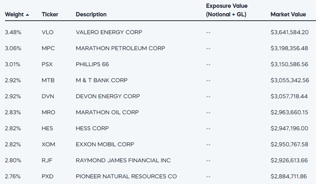
EQRR’s top ten holdings total 29.42% and include eight Energy stocks like Valero Energy (VLO), Marathon Petroleum (MPC), and Phillips 66 (PSX). M&T Bank (MTB) and Raymond James Financial (RJF) are the two stocks in the Financials sector, but they are smaller large-cap stocks with market capitalizations of $31 billion and $20 billion, respectively.
ProShares
The total allocation to the top ten stocks is relatively low but necessary to ensure a decent level of diversification. Still, many of these assets are likely strongly correlated with each other. Again, I emphasize that EQRR is a complementary product and should not act as a core holding in your portfolio.
Performance Analysis
Actual Performance
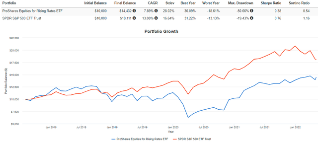
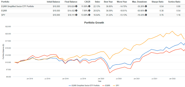
Since its launch in July 2017, EQRR has gained an annualized 7.85% vs. 13.08% for SPY. Importantly, EQRR lost 44.74% in Q1 2020 primarily because it tends to overweight Financials and Energy, and those sectors were struck hard at the onset of the pandemic. If nothing else, use this graph as a reminder of how poorly EQRR will perform if rates fall. Allocate accordingly based on your conviction that rates will rise and a recession will be avoided.
Portfolio Visualizer
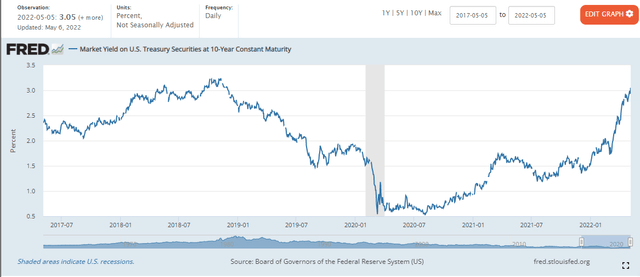
Today, the 10-Year U.S. Treasury Securities market yield is 3.05%, up from the 0.54% low hit in March 2020.
St. Louis Federal Reserve , FRED
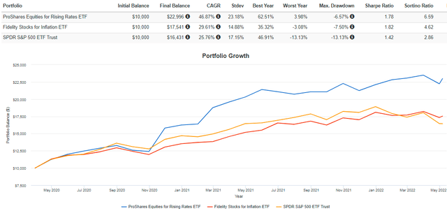
Accordingly, EQRR has succeeded since. From April 2020, EQRR gained an annualized 46.87% compared to 29.61% for FCPI and 25.76% for SPY. In other words, it works well if you know rates are about to rise. On the other hand, FCPI is a less-aggressive move. It experienced about half the drawdown in Q1 2020 and is still ahead of EQRR since its November 2019 launch.
Portfolio Visualizer
Performance Attribution Analysis
I mentioned earlier how skeptical I was of EQRR’s stock selection effect. I decided to look at EQRR’s sector allocations as reported in its annual and semi-annual reports to test this. My question is simple: if an investor held sector ETFs in the same allocations as EQRR, would they outperform? If yes, then EQRR has not demonstrated a superior stock selection effect, and investors are better off mirroring the sector exposures using low-cost sector ETFs. If no, then the opposite is true. EQRR’s strategy picked the best-of-the-best stocks in each sector. Let’s start with the allocation changes since it launched using N-CSR and N-CSRS reports filed with the SEC.
The Sunday Investor
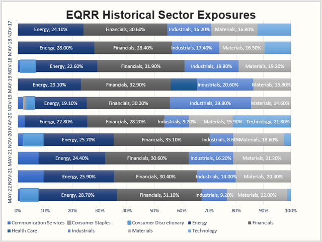
As shown, apart from the periods ending November 2017 and May 2020 where Technology played a significant role, four sectors consistently make up the lion’s share of EQRR: Energy, Financials, Industrials, and Materials. A shortcoming of my simplified analysis is that it rebalances semi-annually while EQRR rebalances quarterly, but given the consistency of the sector allocations and the fact that passive investors likely won’t want to rebalance frequently anyways, I’m hoping it’s adequate. For your reference, I’ve assigned low-cost sector ETFs as follows:
- Communication Services: Vanguard Telecom Services ETF (VOX)
- Consumer Staples: Consumer Staples Select Sector ETF (XLP)
- Consumer Discretionary: Consumer Discretionary Select Sector ETF (XLY)
- Energy: Energy Select Sector ETF (XLE)
- Financials: Financial Select Sector ETF (XLF)
- Health Care: Health Care Select Sector ETF (XLV)
- Industrials: Industrial Select Sector ETF (XLI)
- Materials: Materials Select Sector ETF (XLB)
- Technology: Technology Select Sector ETF (XLK)
Let’s take it period by period on the assumption that the sector allocations for each period were the same for the preceding six months. Of course, this won’t be entirely true, but I think it’s accurate enough to assess EQRR’s stock selection abilities.
July 2017 – November 2017
For the period ending November 2017, investors using sector ETFs would have fared much better from both a risk and returns perspective. The sector ETF portfolio gained 8.98% compared to 7.70% for EQRR and 7.92% for SPY. As measured by standard deviation, volatility was nearly half as much.
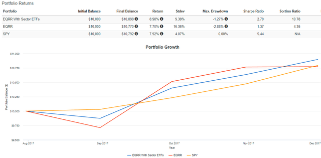
Portfolio Visualizer
December 2017 – May 2018
The opposite was true for the period ending May 2018, as EQRR outperformed by 11.80% with only marginally higher risk. During this period, the yield on U.S. Treasury securities rose from 2.37% to 2.83%, so the Index performed as advertised, and the stock selection effect was significant.
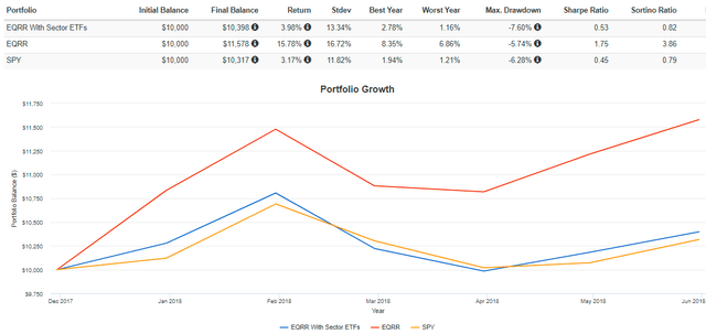
Portfolio Visualizer
June 2018 – November 2018
Unfortunately, for the six months ending November 2018, we saw EQRR give back a significant portion of the prior period’s performance. It lost 11.62% compared to 3.85% for the simulated portfolio of sector ETFs. Again, higher volatility was a theme, with annualized standard deviation being 2.64% more for EQRR. Rates rose modestly from 2.83% to 3.01% during this period.
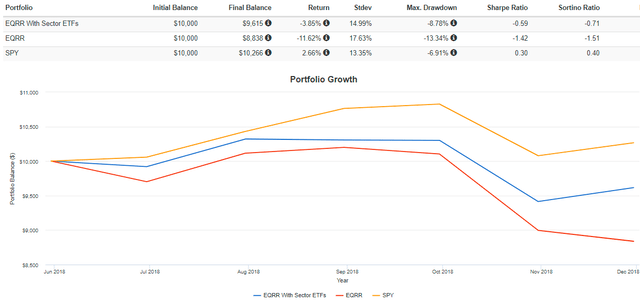
Portfolio Visualizer
December 2018 – May 2019
For the six months ending May 2019, the sector ETF portfolio outperformed again by 8.02% and with 6.28% less annualized volatility. Rates fell sharply from 3.01% to 2.14%, so these poor results aren’t unexpected. Still, the amount of timing risk investors are taking on is substantial.
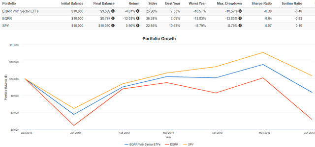
Portfolio Visualizer
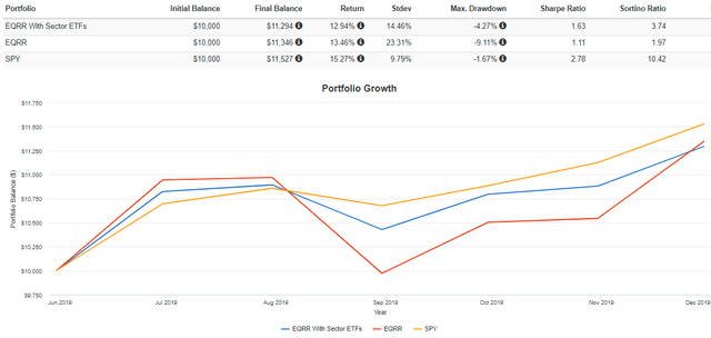
June 2019 – November 2019
Rates continued to decline for the period ending November 2019, going from 2.14% to 1.78%. However, EQRR surprisingly gained 13.46%, but only 0.52% better than the sector ETF portfolio. Annualized volatility was almost 9% more.
Portfolio Visualizer
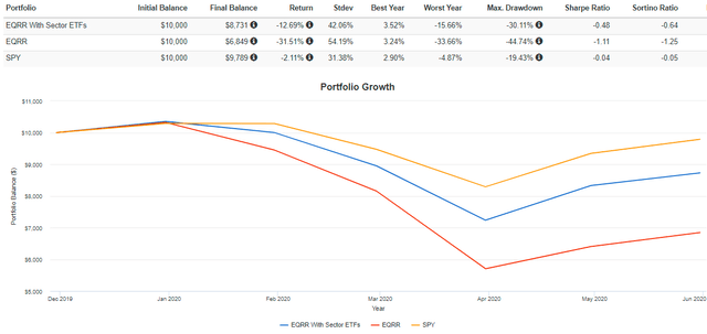
December 2019 – May 2020
For the period ending May 2020, rates cratered from 1.78% to 0.65%, but SPY was almost able to squeak out a gain due to extraordinary fiscal stimulus. EQRR wasn’t so lucky, losing 31.51% after the 44.74% drawdown in Q1 2020. The simulated sector ETF portfolio fared much better, losing 12.69%.
Portfolio Visualizer
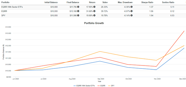
June 2020 – November 2020
For the period ending November 2020, EQRR gained a massive 31.68% compared to 17.95% for the sector ETF portfolio and 19.98% for SPY. As is usual, annualized volatility was much higher at 39.72%, but risk-adjusted returns (Sharpe and Sortino Ratios) were still the best. Undoubtedly, this was EQRR’s best period, and it seemed to happen all toward the end of the year when market sentiment was nearing its high point. Interest rates were back on the rise and ended November at 0.84%.
Portfolio Visualizer
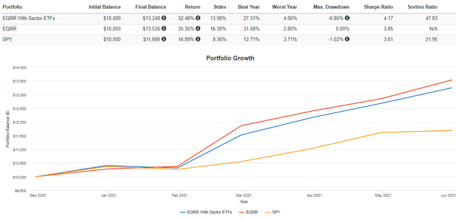
December 2020 – May 2021
For the period ending May 2021, EQRR continued its strong run, gaining 35.36%. However, this was only 2.88% better than the lower-risk sector ETF portfolio. Rates finished May at 1.58% and were as high as 1.74% at the end of March.
Portfolio Visualizer
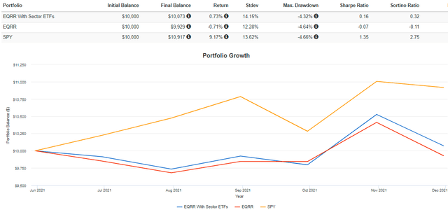
June 2021 – November 2021
For the period ending November 2021, returns were essentially flat for EQRR and the simulated sector ETF portfolio, but SPY gained 9.17%. Rates were range-bound for most of this period, ultimately ending up at 1.52%.
Portfolio Visualizer
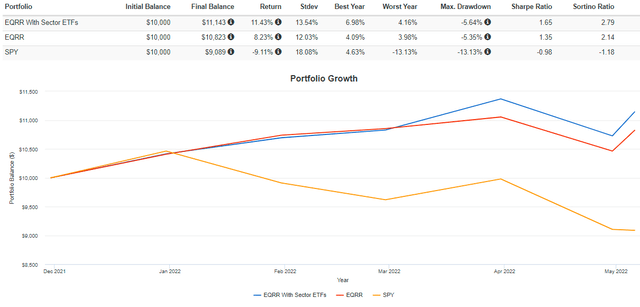
December 2021 – May 2022
Finally, from December 2021 through May 6, 2022, EQRR continued its outperformance over SPY. However, it underperformed the sector ETF portfolio by 3.20%. During this period, rates rose from 1.52% to 3.05%.
Portfolio Visualizer
The following graph summarizes the growth of $10K for each of these two portfolios alongside the market yield on U.S. treasuries. These results are solid evidence that EQRR’s stock selection effect is likely not as strong as presented and was probably done selectively using the most favorable periods. While not incorrect, we’d all love to have the benefit of hindsight, and the truth is that it’s tough to predict when interest rates have bottomed. I’m confident higher interest rates are ahead of us, but I am not sure how quickly we’ll get there or if there will be many bumps in between. That’s what makes EQRR riskier than diversified options like FCPI.
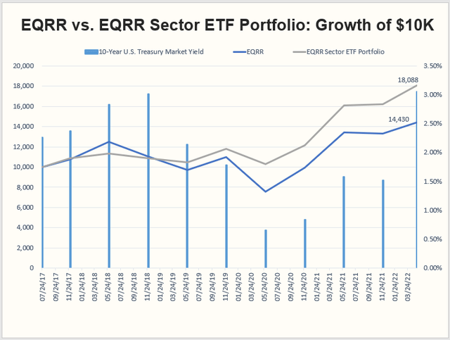
The Sunday Investor
These numbers translate to an annualized gain of 13.29% for the sector ETF portfolio and 8.03% for EQRR. If we were most generous to EQRR and only included the months since June 2020, annualized returns were 40.37% for EQRR compared to 34.06% for the sector ETF portfolio. In my view, that’s hardly enough alpha to justify the excessive risks taken on in having perfect timing and selecting more volatile securities.
On the chance my modeling is inaccurate from only rebalancing once every six months, I have a more straightforward solution. Create a portfolio of just four sector ETFs and rebalance twice per year. Suggested allocations are as follows and are roughly the average allocations EQRR has used since June 2020.
- Energy: 29%
- Financials: 35%
- Industrials: 13%
- Materials: 23%
Let’s see how this setup performed against EQRR since April 2020.
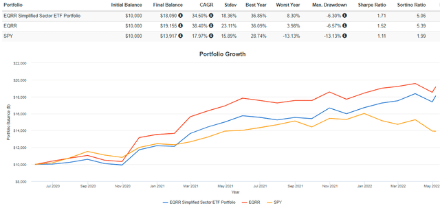
Portfolio Visualizer
And here is the entire performance since EQRR’s inception in July 2017.
Portfolio Visualizer
These two graphs suggest that EQRR is an excellent investment if you purchase it when rates are at the bottom and about to spike. Otherwise, you might as well use sector ETFs as they’ll still offer a lot of the same benefits. Even from June 2020, the sector ETF portfolio gained an annualized 34.50%, almost double SPY and about 4% less than EQRR. That’s still good, and I don’t think it’s wise to get too greedy.
Fundamental Analysis
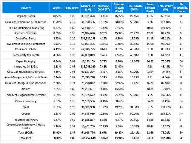
Finally, I want to give a quick snapshot of EQRR’s current portfolio. The table below highlights selected fundamental metrics for EQRR’s top 20 industries compared with SPY. In my view, EQRR resembles a classic deep-value fund that has high estimated growth rates to go along with a low price-earnings ratio. The fundamentals are similar to the Pacer US Cash Cows 100 ETF (COWZ), which I reviewed here. COWZ also looks excellent from a fundamentals perspective, but as I explained in this article, it’s the exit strategy that bothers me the most. However, it should continue to perform well with high inflation and interest rates.
Portfolio Visualizer
While EQRR’s growth and valuation are attractive, it comes at a price. Specifically, it has 28% more concentration in the top 20 industries than SPY, its constituents are almost 50% more volatile as measured by their five-year betas, and they aren’t as profitable. I suggested earlier how EQRR tends to hold smaller large-cap stocks, and this analysis confirms it. The weighted-average market capitalization is only $64 billion compared to $542 billion for SPY, and apart from Diversified Banks and Integrated Oil & Gas stocks, all are under $100 billion. Usually, size and profitability go hand in hand, so I find this consistent with the lower Profitability Grade.
Investment Recommendation
EQRR is a great concept on paper. It’s designed explicitly for rising rate environments, and the broad consensus is that rates will increase. Indeed, it has done exceptionally well since yields bottomed, but I’m surprised at the excessive risk. Moreover, investors taking a more passive approach with sector ETFs would have also done well and experienced much less risk. In fact, during the most significant rise in 10-Year U.S. Treasury yields from November 30, 2021, until May 6, 2022 (1.52% to 3.05%), the simulated sector ETF portfolio outperformed EQRR by 3.20%.
At the fundamental level, EQRR shares many of the same characteristics as other successful funds this year, like COWZ: cheap valuations, extraordinary growth, but high levels of concentration and volatility. I like the exposure areas today but am not recommending investors take on the additional risk. Therefore, EQRR is a hold today, and I look forward to discussing it and other alternatives in the comments section below.