
sankai
ProShares UltraPro QQQ ETF (NASDAQ:TQQQ) and ProShares UltraPro Short QQQ ETF (NASDAQ:SQQQ)
These two ETFs, with assets of $16 billion and $4.5 billion respectively, account for almost a third of the value of the 137 funds in the ProShares family. They are highly leveraged ETF’s, which try to return three times the performance of the NASDAQ QQQ. TQQQ is long the QQQ and the SQQQ short, meaning it tries to go up three times the amount of a market decline in QQQ. Following investor buying in these two funds has provided insight in the past into where the stock market was about to go.
Let’s see what the current numbers are saying.
TQQQ
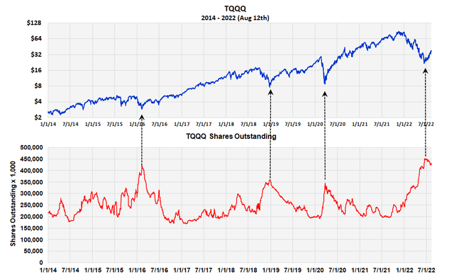
TQQQ Shares Outstanding (Michael McDonald)
This chart plots the number of TQQQ shares outstanding against its price back to 2014. When more investors enter the fund then leave it, the number of shares increase. When more investors leave the fund then buy it, the number declines. In truth it’s more the amount of money going in and out of the ETF that’s important, not so much the number of investors, but these two correlate.
As the chart clearly shows, important stock market bottoms seem to occur when the greatest number of shares of TQQQ are outstanding. Three major market bottoms occurred since 2014 each accompanied by a surge in shares outstanding. The three include the COVID induced, 2020 March bottom. While this is opposite what one might expect using the theory of contrary opinion, one cannot deny the data.
June recorded a record number of shares at 450 million and at 430 million as of August 12, it has stayed near this high-level. We believe this fact is important confirmation that this stock market will move higher.
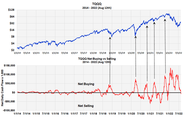
TQQQ Investors Cash Flow (Michael McDonald)
This graph plots the cash flow of TQQQ, which is the amount of money moving into or out of the fund. Points above the zero line represent money going into the fund, points below it represent net money going out. It is this cash flow accumulating over time that produces the number of shares outstanding shown in the previous chart. This chart clearly shows the huge amount of money that poured into the ETF on the first and second downward price waves.
The curve just went to a small net outflow late last week, but this in the past has been a normal occurrence as prices advanced off a major bottom.
This investor data on TQQQ confirms what investor data in SQQQ has also been saying. We presented this data on SQQQ in an SA article two weeks ago, which we’ll summarize and update here.
SQQQ
investor activity in SQQQ does validate and follow the theory of contrary opinion. Heavy buying in this fund, which goes short the QQQ in a highly leveraged fashion, almost always occurs at major stock market bottoms. The chart below shows this.
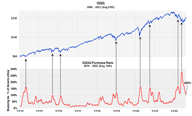
Buying in SQQQ as % of Assets (Michael McDonald)
It plots the amount of buying in the fund as a percentage of the fund’s assets back to 2014. It’s graphed against the QQQ for comparison. The black arrows indicate high levels of investor buying in this fund. Each peak in buying occurred at a significant turning point in the market. The highest point of buying in this leveraged short ETF occurred in late May very close to the recent market bottom.
We believe investor activity in these two ETF’s are confirming what we been saying now for a month and a half – that the May-June Lows represented the start of a new bull market.
MSI
We presented the Master Sentiment Index (MSI) in a July 28th SA article pointing to the belief it was indicating the start of a new bull market. The MSI is a composite sentiment index made from seven classic sentiment indicators including puts to calls ratios, commitment of trader’s data and AAII bull-bear surveys. The index goes from +10 to -10, with +10 representing the greatest amount of bullish sentiment and -10 the greatest amount bearish sentiment.
The chart below shows this composite back to 2006. The graph below it shows the composite in greater detail from 2018 to present (August 12th).
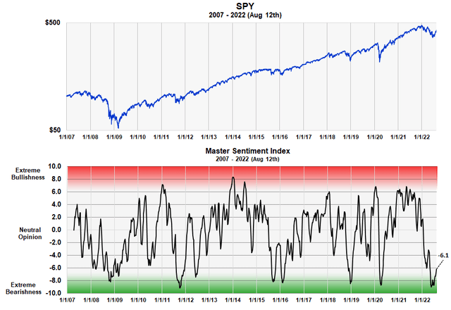
Long Term MSI Index (Michael McDonald)
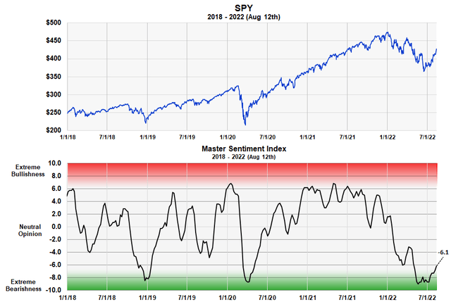
MSI Shorter Term View (Michael McDonald)
Notice that the MSI went to greater bearish extremes in May and June than any time since 2006, including the great bear market of 2009. Remember, this is a contrary opinion indicator, which holds that major market bottoms occur when you get extreme levels of bearish sentiment. The table below shows the ranking of each one of the components that make up the composite.
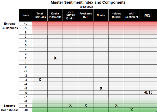
MSI Composite Indicator Table (Michael McDonald)
The latest reading of the MSI as of August 12th is -6.1, which is a very low level considering the size of the market rally that’s occurred since the May-June bottom.
Conclusion
We believe all these statistics continue to point to, and confirm, that we have started into a new bull market. While the possibility exists that extreme global events, both politically and militarily, might occur that would drive prices to new lows; in the absence of this, we think the market has made its lows.
This would once again confirm the well established fact that markets almost always bottom at the start of, or in the middle of, a recession.