[ad_1]
Apisorn/iStock Editorial via Getty Images
The Technology Select Sector SPDR Fund (NYSEARCA:XLK) is a cap-weighted index of all the companies included in the S&P 500 that are classified as members of the GICS Information Technology sector. Just over 85% of those stocks are classified as Business Equipment (BusEq) in the Fama-French 12-sector dataset that goes back to 1926. Based on the history of the Business Equipment sector’s behavior, it is likely that XLK will see sharply lower returns for the remainder of the decade, and it is likely we are already in the early stages of that long-term downturn. The three primary elements of this analysis are the sector’s dividend yield, its relative performance, and the cyclical spike in commodity prices. Moreover, history suggests that when we look back in 2030, Microsoft (MSFT) and Apple (AAPL) will likely have underperformed the rest of the XLK constituents.
What has been driving XLK’s returns?
The table below lists the top 20 holdings of XLK, their weight, and their GICS and Fama-French classifications.
|
The Technology Select Sector SPDR® Fund holdings as of 11-Mar-2022 |
||||||
|
Name |
Ticker |
Weight |
Cumulative |
GICS Industry |
FF12 |
|
|
Apple Inc. |
AAPL |
24.7 |
24.7 |
1 |
Technology Hardware, Storage & Peripherals |
Business Equipment |
|
Microsoft Corporation |
MSFT |
21.5 |
46.2 |
2 |
Software |
Business Equipment |
|
NVIDIA Corporation |
NVDA |
4.0 |
50.2 |
3 |
Semiconductors & Semiconductor Equipment |
Business Equipment |
|
Visa Inc. Class A |
V |
3.5 |
53.7 |
4 |
IT Services |
Other |
|
Mastercard Incorporated Class A |
MA |
3.0 |
56.7 |
5 |
IT Services |
Other |
|
Broadcom Inc. |
AVGO |
2.5 |
59.2 |
6 |
Semiconductors & Semiconductor Equipment |
Business Equipment |
|
Cisco Systems Inc. |
CSCO |
2.5 |
61.7 |
7 |
Communications Equipment |
Business Equipment |
|
Adobe Inc. |
ADBE |
2.1 |
63.8 |
8 |
Software |
Business Equipment |
|
Accenture Plc Class A |
ACN |
2.1 |
65.9 |
9 |
IT Services |
Other |
|
salesforce.com Inc. |
CRM |
2.1 |
68.0 |
10 |
Software |
Business Equipment |
|
Intel Corporation |
INTC |
2.0 |
69.9 |
11 |
Semiconductors & Semiconductor Equipment |
Business Equipment |
|
Qualcomm Inc |
QCOM |
1.8 |
71.8 |
12 |
Semiconductors & Semiconductor Equipment |
Business Equipment |
|
Advanced Micro Devices Inc. |
AMD |
1.8 |
73.6 |
13 |
Semiconductors & Semiconductor Equipment |
Business Equipment |
|
Texas Instruments Incorporated |
TXN |
1.7 |
75.3 |
14 |
Semiconductors & Semiconductor Equipment |
Business Equipment |
|
Oracle Corporation |
ORCL |
1.3 |
76.6 |
15 |
Software |
Business Equipment |
|
Intuit Inc. |
INTU |
1.3 |
77.9 |
16 |
Software |
Business Equipment |
|
PayPal Holdings Inc. |
PYPL |
1.2 |
79.1 |
17 |
IT Services |
Other |
|
Applied Materials Inc. |
AMAT |
1.2 |
80.3 |
18 |
Semiconductors & Semiconductor Equipment |
Business Equipment |
|
International Business Machines Corporation |
IBM |
1.2 |
81.5 |
19 |
IT Services |
Business Equipment |
|
ServiceNow Inc. |
NOW |
1.1 |
82.6 |
20 |
Software |
Business Equipment |
Almost all of the companies categorized as Other in the Fama-French 12-sector system are IT Services. As the chart from S&P Global shows below, IT Services is one of the two industries that form the Software & Services Industry Group (led by Microsoft). Technology Hardware & Equipment (led by Apple) and Semiconductor & Semiconductor Equipment (led by Nvidia) are the other two industry groups.
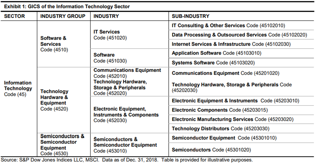
Chart A. GICS classifications for the Info Tech Sector (S&P Global)
The chart below shows the weighting by GICS industry, color-coded by industry group.
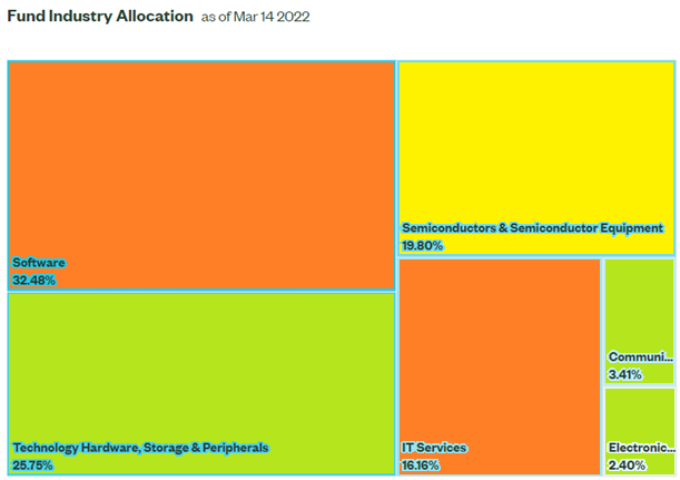
Chart B. Software & Services is the largest industry group in XLK. (S&P Global)
A cross-comparison of the holdings table with this chart suggests that Microsoft makes up about two-thirds of the Software industry and Apple makes up over 80% of the Technology Hardware, Storage & Peripherals industry. No other members of this industry make up the top 20 of XLK, and the next biggest by market cap is HP Inc. (HPQ) at 0.4% of the Information Technology index. Semiconductors and IT Services are far less top-heavy.
The chart below shows the 7.5-year performances of XLK and the current top four holdings and HPQ.
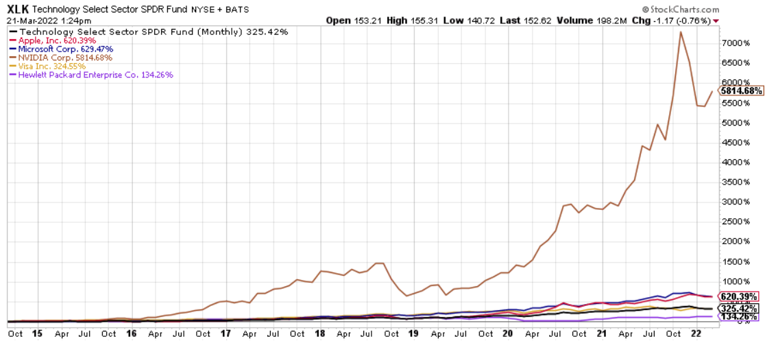
Chart C. The Top Four have lifted XLK over the last two years. (Stockcharts.com)
I have not gone through all the holdings, but it appears that gap between the largest and smallest companies within the XLK (by market cap) opened up with the pandemic. The chart below makes the point somewhat more convincingly. It shows the ratio between the index when weighted by value and weighted equally (RYT).
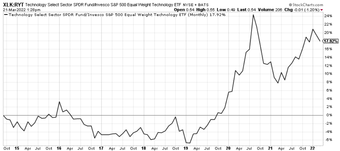
Chart D. Large caps have provided more lift than smaller caps (Stockcharts.com)
The industry group chart below suggests that this gap has been caused by a ‘reverse size effect’ at play rather than due to strength in a particular group, although the Hardware (red) and Semiconductor (brown) industrial groups seem to have done better than the Software group during the pandemic. (For analysis directed towards software stocks, please see my article on the Communications Services (XLC) from earlier this month).
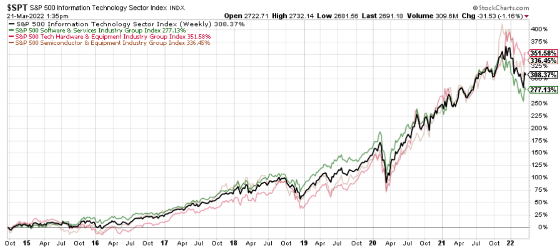
Chart E. Hardware and Semiconductors did slightly better than Software during the pandemic. (Stockcharts.com)
What has happened in previous instances of a ‘reverse size effect’ occurring in the tech sector? Let’s see.
Historical performance of small-cap information technology stocks
In the following chart, I show 7.5-year changes to the ratio of equal-weighted to value-weighted Business Equipment indexes (in blue), somewhat similar to the RYT/XLK ratio above, and the ratio of an equal-weighted index of equal-weighted sectors to an equal-weighted index of value-weighted sectors (in orange), a proxy for the ratio of small-cap to large-cap stocks.
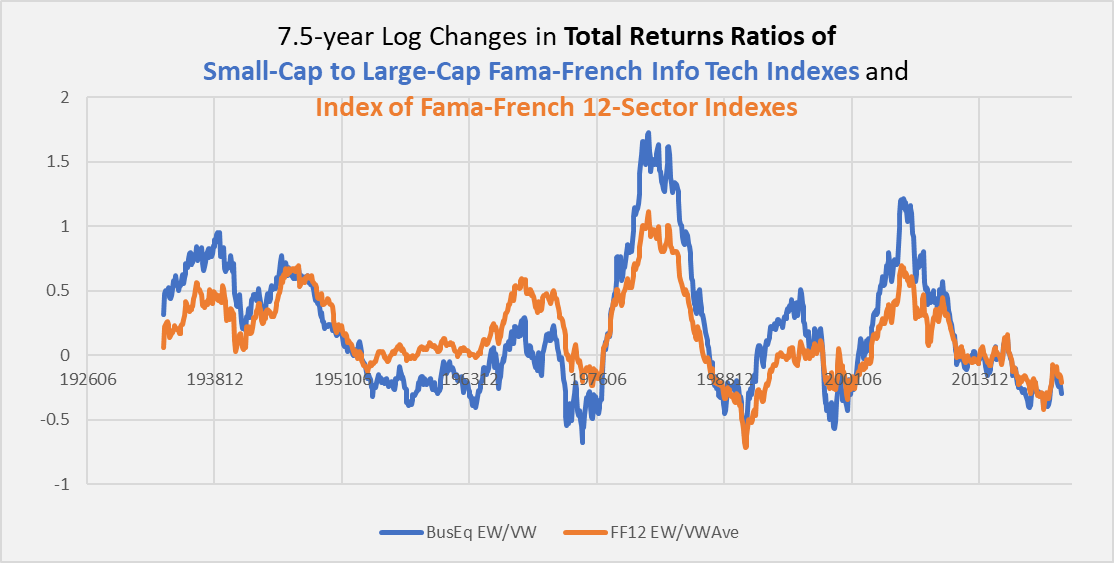
Chart F. Size effect within tech parallels size effect in the market. (Fama-French)
What it shows is that outperformance/underperformance of small-caps in the Business Equipment sector tends to track with the outperformance/underperformance of small-caps generally. This was also the case in the transportation industry. And, as I showed in Prepare For The Return Of The Size Effect, long-term outperformance of smaller-cap stocks primarily occurs during bear markets in large-cap stocks.
In other words, those occasions when large caps are outperforming tend to occur during bull markets (as in the 1950s-60s, 1980s-1990s, and 2010s-present). Keep this in mind, as we will return to this at the end of the article.
What are the best conditions for “secular” bull markets in the tech sector?
History suggests that large-cap stocks like two things: high earnings growth and low commodity inflation. Preferably together. That is illustrated in the following chart, which shows price returns for the Business Equipment sector in blue, S&P Composite earnings in orange, and commodity price inflation in green.
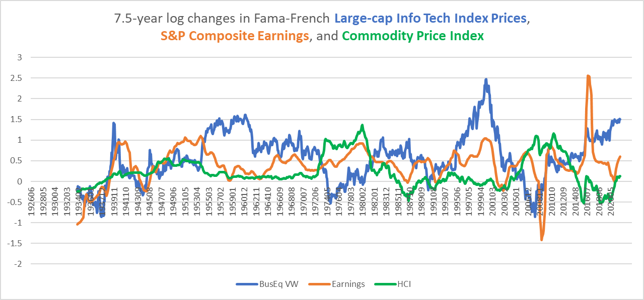
Chart G. Tech stocks do well when earnings outperform commodities. (Fama-French, Shiller, World Bank, Warren & Pearson, St Louis Fed)
Tech stocks have not liked high commodity inflation (as in the 1970s and 2000s), but if the earnings growth is robust enough (as in the 1940s), they can produce positive returns. Low inflation has not been good when earnings growth has also been anemic (as in the 1930s).
So, history suggests whether or not tech stocks are going to do well in the remainder of the decade depends “simply” on whether earnings growth will exceed commodity inflation between now and 2030. In The Death Of Irrational Exuberance, I tried to show that history suggested that both growth and inflation were likely to be low.
Commodity inflation, as you can see partly in the chart above, but more completely in my recent article on commodities, has historically had long periods of commodity disinflation punctuated by commodity supercycles (as in the 1910s, 1940s, 1970s, 2000s, 2030s(?)). In the absence of clear indications one way or the other, history suggests low commodity inflation is likely in the remainder of the 2020s.
When earnings growth and the PE for the S&P Composite have both been high simultaneously, what typically follows is a short-term collapse in growth and a long-term decline in stock returns. In other words, a decline in the ratio of earnings to commodity prices. The 1920s and 1990s were the most famous of these bull markets, but it also occurred in the 1960s and the 2010s. Each of these decades (i.e., the 1930s, 1970s, and 2000s) were followed by earnings growth well below the rate of commodity inflation.
Tech’s role in secular bull markets
We only have 150 years’ worth of data for broad indices like the S&P Composite and less than 100 for sectors and industries, but the former suggest that every bull market ends with a rise in both PE and earnings growth (again, please see “The Death of Irrational Exuberance” for a review of that history). Similarly, tech booms tend to occur at the conclusion of these bull markets as well.
But, we can speak more generally about long-term sector rotations. Periods in which the following conditions have tended to see seven or more years of reversals in the prevailing sectoral hierarchy:
- Extreme dispersions in sectoral performances.
- Transitions in the long-term momentum of energy prices.
- A cyclical energy shock.
I outlined the historical “rules” for this in a handful of articles last year, for example in A Primer On Long-Term Sector Rotations And Where We Are Now. These “rules” are especially powerful when the tech and energy sectors are at opposite poles, as they have been for much of the last decade (see the following chart).
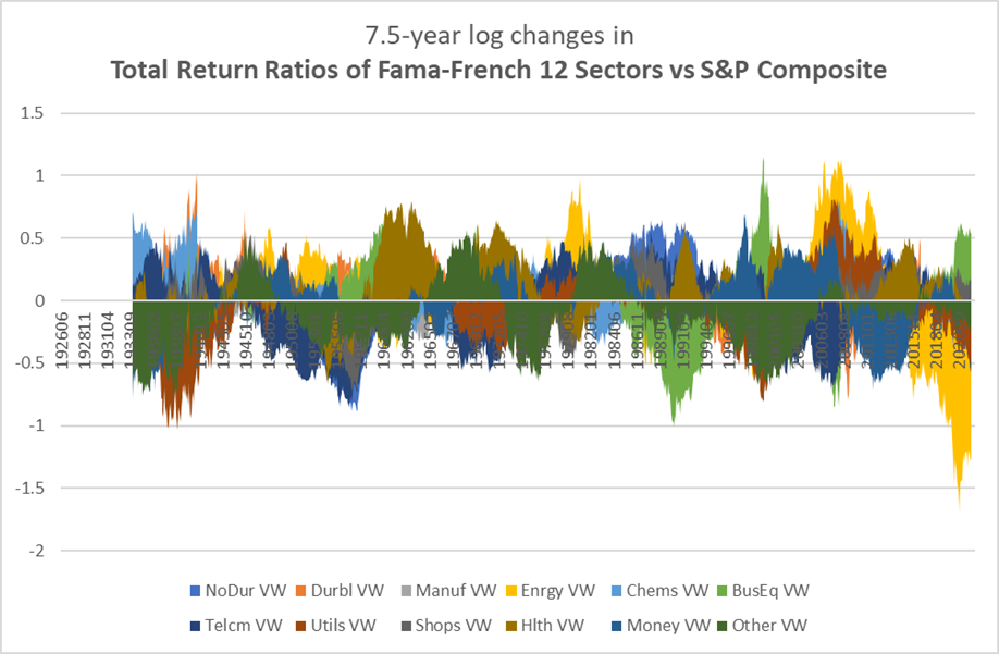
Chart H. The energy sector has had the worst decade of any sector ever (on a relative basis). (Fama-French, Shiller)
As I wrote a year ago, all of these conditions have been met, and this is likely to lead—or so history suggests—to a reversal of fortunes of tech and energy, and this seems to be more and more in evidence each month. Add on top of that the tendency for long-term outperformance in energy to coincide with depressed returns for the market as a whole, that suggests that tech stocks are likely to underperform during a “secular” bear market. (Since transitions to both secular bear markets and new sectoral hierarchies typically involve severe cyclical bear markets, I have hesitated going long energy, despite my long-term thesis).
Okay, let’s regroup. My argument thus far is that (a) high PEs and high growth rates in the broad market are typically followed by falling earnings/commodity ratios and low stock returns, (b) sectoral dynamics point to low market returns and low relative performance of tech stocks, and (c) transitions to “secular” bear markets and new sectoral regimes tend to begin with market crashes preceded by cyclical spikes in commodity prices.
What about valuations?
Tech dividend yields and subsequent returns
As far as I am aware, there is no long-term earnings data for the Fama-French industries and sectors, but we can estimate the dividend yield by contrasting total returns and price returns. In the following chart, you can see that the dividend yield has tended to anticipate subsequent returns, despite the break in the long-term equilibria between prices, earnings, and dividends.
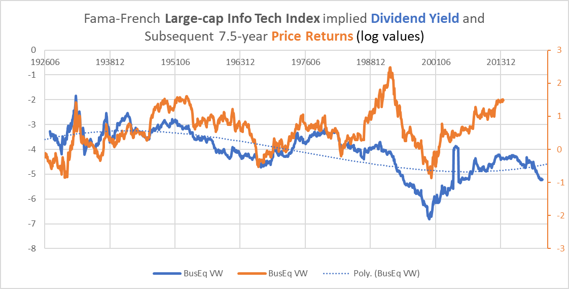
Chart I. The dividend yield has anticipated tech returns over the last century. (Fama-French)
And we are well into the second-lowest wave ever.
The following chart contrasts the dividend yield for the S&P (in orange) with that of tech stocks (in blue).
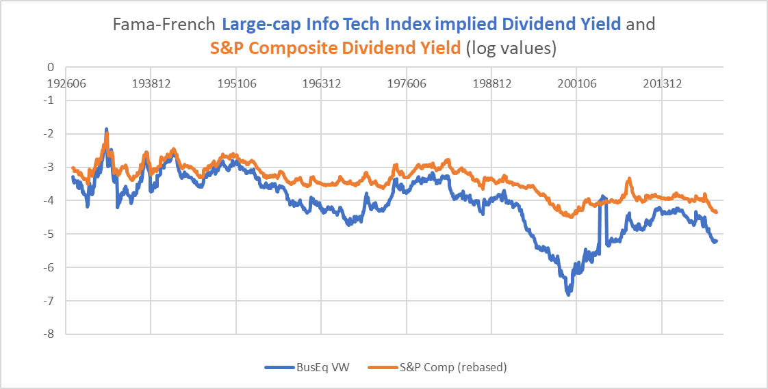
Chart J. The dividend yield for tech has always been lower than S&P Composite’s (Fama-French, Shiller)
The spread between the two has made little difference, historically, in subsequent relative returns. The absolute value of the yield has been more predictive (that is, of absolute returns).
So, the relatively low level of the dividend yield suggests that returns going out until the end of the decade will be low, perhaps even negative.
We have a host, therefore, of fairly reliable historical indicators of a decade of very low returns for the stocks that make up the XLK. Unsustainable PEs and long-term growth for the market as a whole, sector rotations and energy shocks, high valuations reflected in the Business Equipment sector’s low dividend yield.
What about Microsoft and Apple? How might they perform?
Microsoft and Apple likely to be among the worst performers
Based on everything argued thus far, it is difficult to see how Microsoft and Apple will not be among the worst performers. Why? There is a size effect within the tech sector that has historically paralleled the size effect within the broader market, and this is primarily a bear market phenomenon. That is, in a “secular” bear market, small caps, over long spans, are likely to outperform large caps. In other words, large caps will underperform, and within the XLK, Microsoft and Apple are THE large caps.
Or, to be more precise, what we have been comparing is a value-weighted index and the same index equal-weighted. If the equal-weighted index outperforms the value-weighted index, there is no mathematical alternative but for the larger caps to underperform the smaller caps. Thus, where the tech sector is likely to be among the worst-performing stocks until the end of the decade and cap-weighted indexes are to underperform equal-weighted indexes, Microsoft and Apple will likely be the worst of the worst.
This is likely to be a drawn-out affair. Small caps tend to be more cyclical and thus might be expected to decline faster and farther initially, but by the end of the decade, they will likely have fared better than these mega-cap tech companies.
Conclusion
Historically, “secular” bear markets have been periods where things turn upside down. The primary sector that we take for granted—agriculture and mining—become dominant while technology and services become subservient. Geopolitical tensions that had always been bubbling under the surface and out towards the periphery suddenly erupt through the old equilibria in what seems a paroxysm of irrationality. Cold wars turn hot.
These phenomena almost seem to have a will of their own. Microsoft had one trajectory in the 1980s and 1990s, another in the 2000s, and yet another in the 2010s and thus far in the 2020s.
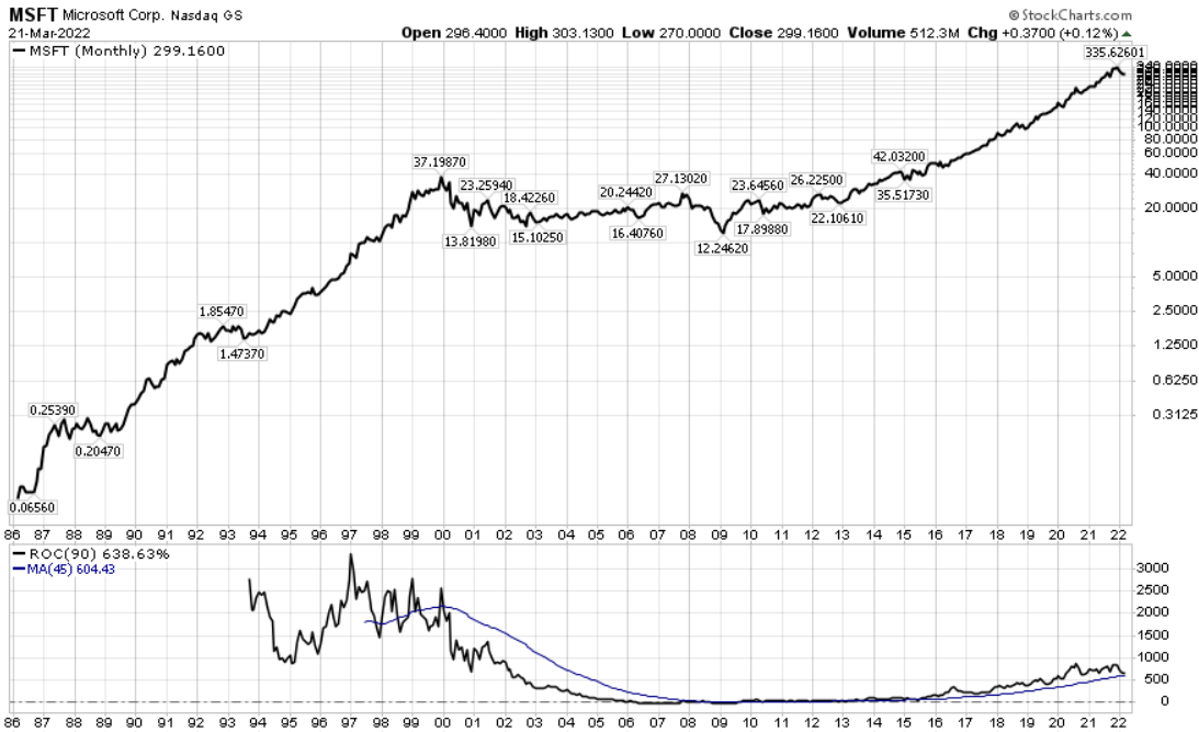
Chart K. Time for a new trajectory. (Stockcharts.com)
For all of the reasons stated above, Microsoft, Apple, and the XLK as a whole are likely to find a new trajectory over the next decade. That trajectory is likely to be significantly lower.
[ad_2]
Source links Google News

