[ad_1]
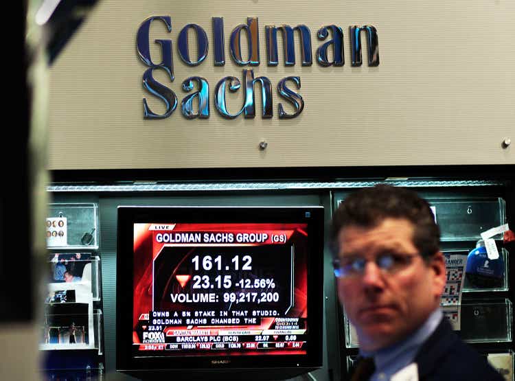
Chris Hondros/Getty Images News
The iShares U.S. Broker-Dealers & Securities Exchanges ETF (IAI) is composed of a large swathe of stocks in the capital markets industry. The ETF tracks the “modified market cap weighted” Dow Jones U.S. Select Investment Services Index (DJSINV). In this article, I am going to argue that IAI is at high risk of suffering both a severe cyclical decline and long-term underperformance. This is based on a historical analysis of the Fama-French Trading index within the 49-industry data set.
More particularly, I will argue that these capital markets stocks are overvalued on a historical basis, underperform during general equity bear markets (whether inflationary or deflationary), and are more vulnerable to commodity inflation than most other industries.
IAI holdings
Fama-French data sets are organized by SIC code, so to identify which of the Fama-French indexes is most appropriate for this kind of analysis, it is necessary to sort the stocks in a given index, in this case IAI, by that code.
As the table of the ETF’s holdings shows below, 99% of the ETF is classified by Fama-French SIC as Trading industry companies, including Morgan Stanley and Goldman Sachs, which make up nearly 40% of the index.
|
IAI holdings as of 2-Mar-22 |
||||||
|
Ticker |
Name |
Sector |
Weight (%) |
Cumulative Weight |
FF49(own calculations) |
|
|
(NYSE:MS.PK) |
MORGAN STANLEY |
Financials |
19.72 |
19.72 |
1 |
Trading |
|
(NYSE:GS.PK) |
GOLDMAN SACHS GROUP INC |
Financials |
17.75 |
37.47 |
2 |
Trading |
|
SCHW |
CHARLES SCHWAB CORP |
Financials |
5.43 |
42.9 |
3 |
Trading |
|
RJF |
RAYMOND JAMES INC |
Financials |
5.24 |
48.14 |
4 |
Trading |
|
LPLA |
LPL FINANCIAL HOLDINGS INC |
Financials |
5.12 |
53.26 |
5 |
Trading |
|
CME |
CME GROUP INC CLASS A |
Financials |
4.99 |
58.25 |
6 |
Trading |
|
MKTX |
MARKETAXESS HOLDINGS INC |
Financials |
4.81 |
63.06 |
7 |
Trading |
|
ICE |
INTERCONTINENTAL EXCHANGE INC |
Financials |
4.69 |
67.75 |
8 |
Trading |
|
CBOE |
CBOE GLOBAL MARKETS INC |
Financials |
4.42 |
72.17 |
9 |
Trading |
|
NDAQ |
NASDAQ INC |
Financials |
4.06 |
76.23 |
10 |
Trading |
|
SF |
STIFEL FINANCIAL CORP |
Financials |
3.58 |
79.81 |
11 |
Trading |
|
JEF |
JEFFERIES FINANCIAL GROUP INC |
Financials |
3.28 |
83.09 |
12 |
Trading |
|
IBKR |
INTERACTIVE BROKERS GROUP INC CLAS |
Financials |
2.67 |
85.76 |
13 |
Trading |
|
HLI |
HOULIHAN LOKEY INC CLASS A |
Financials |
2.51 |
88.27 |
14 |
Trading |
|
EVR |
EVERCORE INC CLASS A |
Financials |
2.33 |
90.6 |
15 |
Trading |
|
LAZ |
LAZARD LTD CLASS A |
Financials |
1.9 |
92.5 |
16 |
Trading |
|
VIRT |
VIRTU FINANCIAL INC CLASS A |
Financials |
1.48 |
93.98 |
17 |
Trading |
|
MC |
MOELIS CLASS A |
Financials |
1.42 |
95.4 |
18 |
Trading |
|
PIPR |
PIPER SANDLER COMPANIES |
Financials |
0.96 |
96.36 |
19 |
Trading |
|
BGCP |
BGC PARTNERS INC CLASS A |
Financials |
0.72 |
97.08 |
20 |
Trading |
|
PJT |
PJT PARTNERS INC CLASS A |
Financials |
0.71 |
97.79 |
21 |
Trading |
|
SNEX |
STONEX GROUP INC |
Financials |
0.61 |
98.4 |
22 |
Trading |
|
RILY |
B RILEY FINANCIAL INC |
Financials |
0.5 |
98.9 |
23 |
Business services |
|
COWN |
COWEN INC CLASS A |
Financials |
0.39 |
99.29 |
24 |
Trading |
|
DHIL |
DIAMOND HILL INVESTMENT GROUP INC |
Financials |
0.31 |
99.6 |
25 |
Trading |
Recent slump in stock prices
During the pandemic, these stocks exploded upwards, outperforming both the S&P 500 (SPY) and the financial sector (XLF) by a wide margin.
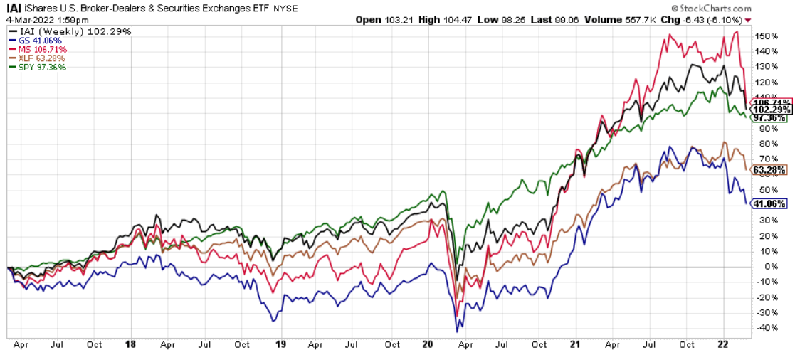
Chart A. Brokerage stocks boomed with Covid… (Stockcharts.com)
But, since the beginning of the year and especially from late February, these stocks have fallen dramatically. Goldman Sachs is inches away from its 52-week low.
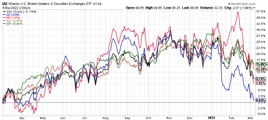
Chart B. …but they are slumping now. (Stockcharts.com)
This sudden deterioration in momentum is more likely a warning than an opportunity. To see why, it is important to put this industry in historical context.
Historical performance of brokerage stocks
The chart below shows 7.5-year changes in the Fama-French Trading index (in blue), the S&P Composite (in green), and a commodity price index composed of the Fed’s producer price index of industrial commodities (PPIIDC) spliced with an average of selected World Bank Pink Sheet commodity prices (in green).
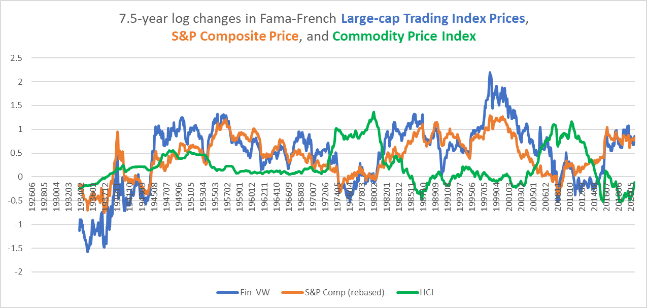
Chart C. Brokerage stocks don’t like inflation, but they hate deflation. (Fama-French data, Shiller data, St Louis Fed, World Bank)
Most readers, I have found, can only deal with so many squiggly lines in a single chart, so I will try to keep this to a minimum, but the two key things to note are a) Trading stocks tend to have high beta and b) the three bear markets (the Great Depression, the 1970s, and late Noughties) occurred under extreme commodity inflation/deflation regimes. The latter two saw extremely high commodity inflation, but the worst bear market for Trading stocks was clearly the deflation of the Depression. They really did not revive until World War II.
The following chart replaces S&P Composite prices with earnings. As long as earnings have grown faster than commodity inflation (that is, as long as the orange line has stayed above the green line), Trading equities have tended to boom. (Strange but true, this is a fairly consistent pattern across stocks: historically, the spread of earnings growth to commodity inflation has been more important than earnings growth itself).
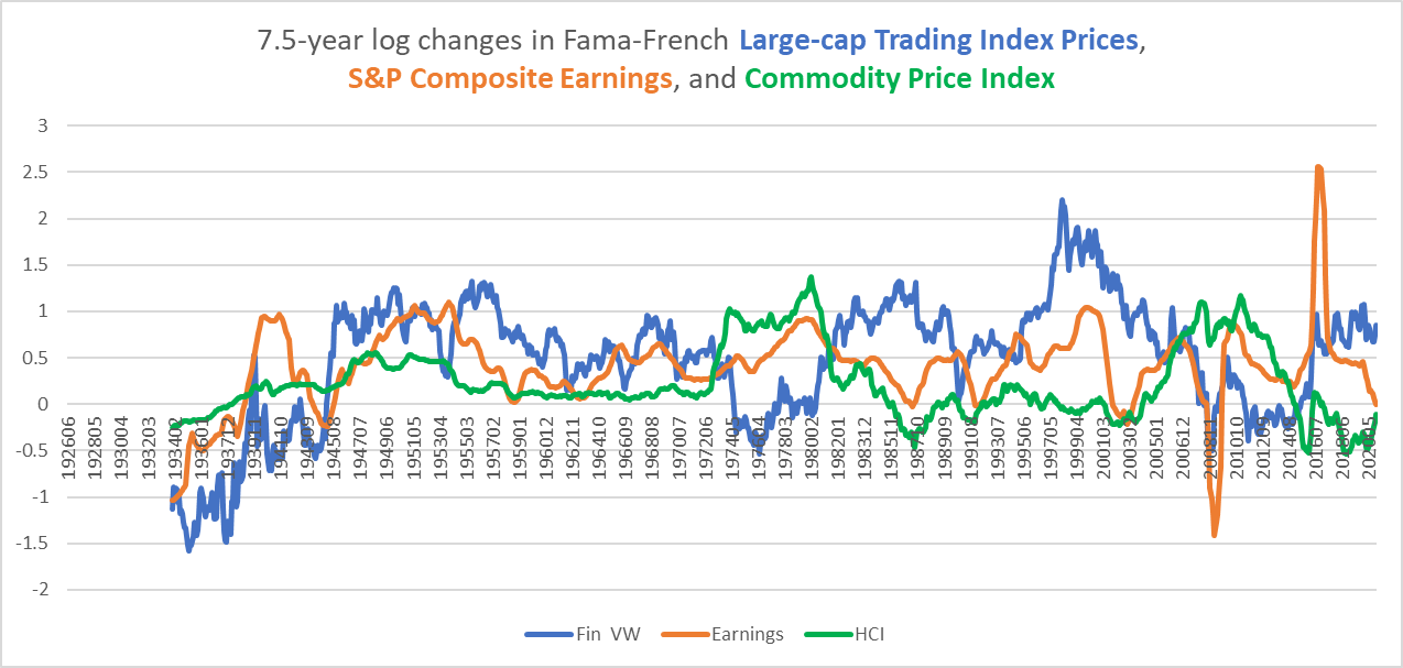
Chart D. As long as earnings grow faster than commodity inflation, brokerage stocks are happy. (Fama-French data, Shiller data, St Louis Fed, World Bank)
In the following chart, we can see the total returns of large- and small-cap Trading stocks relative to the S&P Composite.
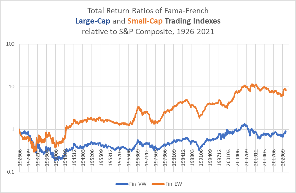
Chart E. Brokerage stocks were smashed during the Depression (Fama-French data, Shiller data)
The damage caused to Trading stocks by the severe deflation of the Depression is evident here. It took about 80 years for the industry to regain its position, only to be knocked back down again by the Great Recession of 2008. Trading stocks do especially well in disinflation but horribly in deflation.
We see much the same in the relationship between Trading equities and Treasury bonds. The Depression was a disaster for the industry.
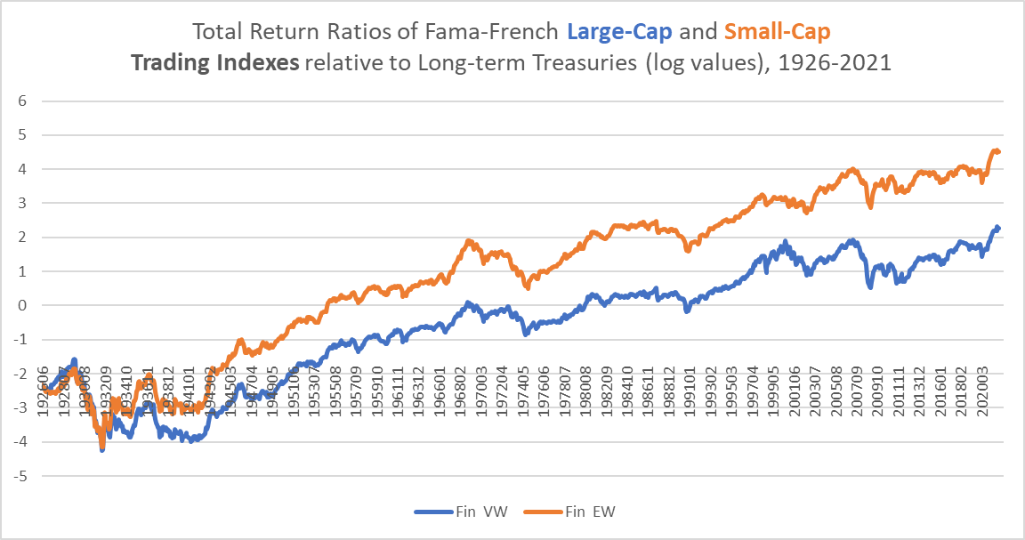
Chart F. It took a generation for large-caps to recover from the Depression. (Fama-French data, St Louis Fed and Shiller data (own calculations))
Are brokerage stocks overpriced?
The single best predictor of long-term returns in the Trading industry is the dividend yield.
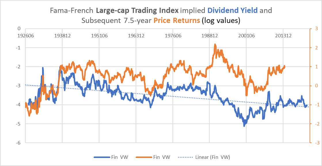
Chart G. The dividend yield has been a good predictor of brokerage returns. (Fama-French data)
This correlation between returns and the dividend yield (I calculated the dividend yield by contrasting total returns with price returns in the Fama-French indices) is higher if we detrend the yield to account for the secular fall in dividend payout ratios in stocks over the last half-century or so.
This leads to a slight problem. The dividend yield is low on a historical basis. Prior to the 1990s, it was extremely rare for the yield to be as low as it has been in the last year. But, it is relatively high compared to where it has been since the late 1990s. A detrended yield suggests that it is fair-valued.
Relative to the S&P Composite, the yield is in the same ballpark.
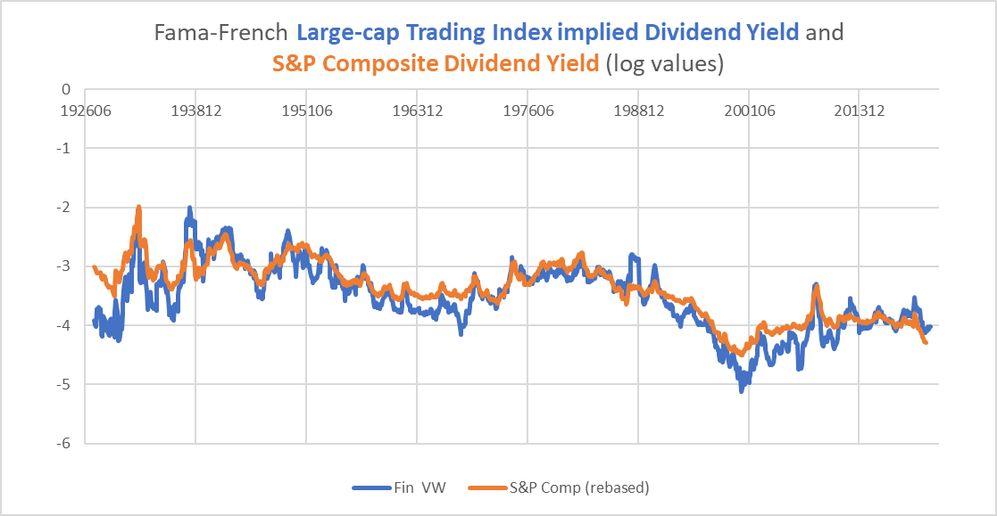
Chart H. The dividend yield is low, although not as low as it has been in the recent past. (Fama-French data and Shiller data)
That, however, is not especially reassuring. The S&P 500 has been at sustained levels of outrageously high multiples for the last 30 years.
I wrote a series of essays late last year reviewing the 150-year history of S&P multiples and earnings growth. That research suggested that periods that saw a combination of abnormally high PE levels and high earnings growth were followed by 7-14 years of flat to negative returns. In a separate analysis of sectoral returns, I found that periods of very high tech sector performance combined with very low energy sector performance also typically were followed by 7 or more years of flat to negative returns in the market as a whole.
Therefore, it is more likely that the absolute level of the dividend yield is likely to be more predictive of subsequent Trading industry returns than is the detrended yield. The next question is whether such a bear market is more likely to be inflationary (as in the 1970s and 2000s) or deflationary (as in the 1930s). My analysis, based on historical patterns in commodity and equity markets (the first link in the previous paragraph), concluded that it was more likely to tend towards deflation.
Bypassing the inflation/deflation conundrum
A deflationary, or even disinflationary, bear market would likely be disastrous for these capital markets industry stocks. But, we have only had one instance in the last century of an extended disinflationary bear market, so it is difficult to be sure.
As a check against this kind of error, I have argued that, because “secular” bear markets have also been highly cyclical-whether they were inflationary or deflationary-trading through the cycle might help avoid losses.
Historically, Trading industry stocks have not been especially cyclical.
The chart below shows cyclical changes in total returns for Trading indexes and S&P Composite earnings.
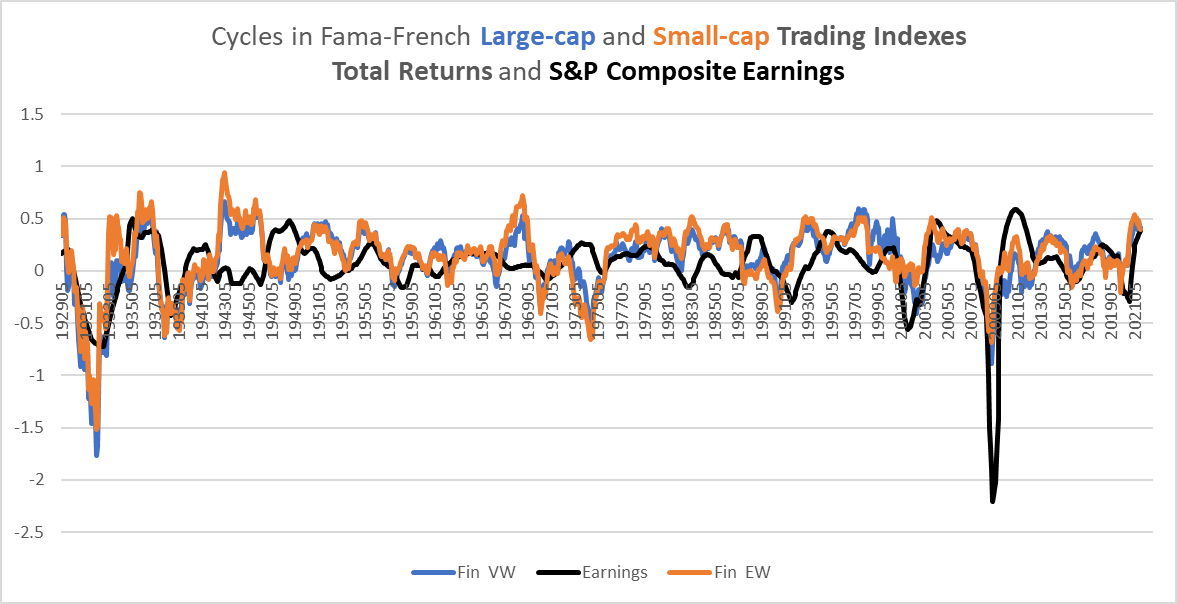
Chart I. Brokerage stocks are not as cyclical as they are often portrayed (Fama-French data, Shiller data)
There are only two periods in which Trading stocks strictly tracked the earnings cycle: the 1930s and the 1990s-present, and the only thing that they have in common is that the earnings cycle tended to be volatile in both periods, with sharp, deflationary bursts. The “secular” bear market of the 1970s did not conform as much to the earnings cycle, but Trading stocks still exhibited highly cyclical behavior.
When anticipating a “secular” bear market, therefore, paying attention to market cycles pays. Under such circumstances, declining momentum is a key indicator that can help avoid severe losses.
And, that is what we are seeing in capital markets equities now, as shown at the beginning of this article in Charts A and B.

Chart J. A cyclical downturn at the “wrong” time suggests dramatically lower returns in the future. (Stockcharts.com)
Brokerage cycles and commodity shocks
Another indicator of a cyclical downturn in Trading stocks has been energy and fertilizer shocks. Over cyclical durations, Trading stocks have a -0.4 correlation with fertilizer inflation. The only two fertilizer shocks worse than what is occurring now were each followed by collapses in earnings growth and stock prices (that is, 1973 and 2008).
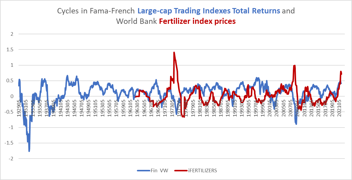
Chart K. For some reason, brokerage stocks and fertilizer prices do not get along. (Fama-French data, World Bank)
Of the nine negative cyclical performances of the large-cap Trading index since oil prices were cut free from their gold standard in the 1970s, seven were followed by spikes in crude oil prices. Only the last two negative cycles in 2016 and 2020 were not preceded by oil shocks.
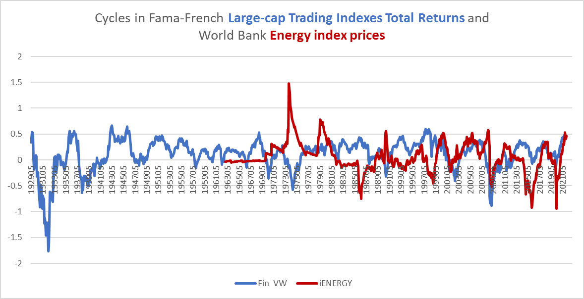
Chart L. Most negative cyclical returns of last 50 years preceded by spike in energy prices. (Fama-French data, World Bank)
As I showed in my piece on long-term sector rotations, these energy shocks appear to play a key role in the ecology of the market.
Conclusion
Therefore, with slowing momentum in these stocks, rising commodity inflation, and a high likelihood of a secular bear market approaching, capital goods stocks are likely to severely underperform the wider market throughout the remainder of the decade and are vulnerable to extreme negative outcomes over cyclical durations.
As the universe of resilient stocks shrinks almost by the day, there are fewer and fewer places to take bullish positions. In my opinion, more defensive positions, in Treasuries, gold, and utilities, are likely to provide higher returns. Gold and utilities, however, may not prove as resilient either in coming months.
An alternative to trying to trade through the cycle is to divide a portfolio up evenly into cyclical stocks, gold (GLD), and Treasuries (TLT), or to marry this evenly balanced portfolio with a cyclical strategy and/or a short position in technology stocks (PSQ). Much of this depends on the degree to which an investor weighs the likelihood of these outcomes and the risk involved. But, setting these strategies aside, long positions in the tech sector and in Trading industry ETFs like IAI are likely to be severely punished in coming months and years.
A Postscript:
In the text above, I mentioned that stock market performance historically depended more on the ratio of earnings to commodity prices than to the absolute level of earnings. This chart, I believe, illustrates that quite clearly. I will update it in an upcoming article about commodity prices.
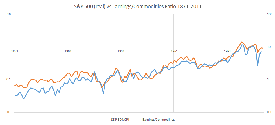
Chart M. To have an opinion on stock returns is to have an opinion on the ratio of earnings to commodity prices. (Shiller data, University of Michigan CPI data, Pfaffenzeller GYCPI data))
Editor’s Note: This article discusses one or more securities that do not trade on a major U.S. exchange. Please be aware of the risks associated with these stocks.
[ad_2]
Source links Google News

